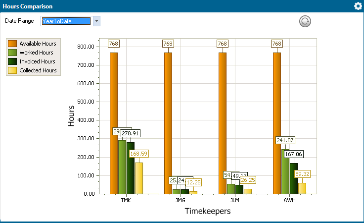
The Hours Comparison app on the Dashboard shows a chart comparing available, worked, invoiced, and collected hours for timekeepers over a selected period of time.

To use the Hours Comparison app:
Use the Date Range setting to select a time span for the chart.
Click the Refresh
button ( ).
).
To edit settings for the apps:
Click the app’s
Settings button and click
Settings. The Hours
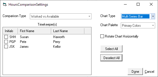
Comparison Settings window appears.

For Comparison Type, select the type of data comparison you want to see.
For Timekeepers, check the timekeepers to include in the chart. Click Select All to select all timekeepers.
For Chart Type, select the type of chart.
For Chart Palette, select the chart colors.
Check Rotate Chart Horizontally if you want to flip the chart's axes.
Click Done to save your changes and close the window.